Table of Contents
ToggleColors can make or break a design, yet many struggle to find the perfect palette. Imagine walking into a room painted in hues that make you feel like a million bucks or scrolling through a website that feels like a feast for the eyes. That’s the magic of a well-chosen color palette. It’s not just about picking pretty shades; it’s about creating an atmosphere, evoking emotions, and sometimes, just making people smile.
What Is Color Palette Inspiration?
Color palette inspiration refers to the creative process of selecting and combining colors to convey a specific mood or theme in design. It plays a crucial role in various fields, including interior design, graphic design, and fashion. Designers often analyze trending colors, seasonal shifts, and cultural influences to develop impactful palettes.
Selecting colors involves more than mere aesthetics. Colors evoke emotions and can influence perception. For instance, warm colors like red and orange often promote feelings of energy and excitement, while cooler shades such as blue and green tend to create a calming effect. Understanding these associations fosters better decision-making in design projects.
Gathering color palette inspiration can come from diverse sources. Nature serves as a prominent inspiration, with its vibrant hues in flowers, landscapes, and seasons. Art movements also provide valuable clues, showcasing unique combinations that can ignite creativity. Online resources such as color theory websites and design platforms offer extensive libraries of curated palettes that facilitate easier selection.
Experimenting with color combinations leads to discovering unique palettes. Utilizing tools like color wheel applications allows users to create harmonious schemes based on complementary or analogous color relationships. Designers often create mood boards to visualize how different colors interact with one another, enhancing overall clarity in their projects.
Inspiration exists everywhere, from architecture to photography. Observing how colors work in real-life settings reveals potential combinations for personal projects. Collecting samples and creating swatches can lead to a deeper understanding of colors’ impact, enabling designers to craft compelling visual narratives.
The Importance of Color Palettes
Color palettes play a crucial role in design, impacting visual appeal and emotional responses. Selecting the right colors enhances both spaces and websites.
Emotional Impact of Colors
Colors strongly influence emotions and perceptions. Warm colors like red and orange evoke energy and excitement, often used in environments aiming to stimulate. In contrast, cooler colors such as blue and green create calmness and relaxation, ideal for serene settings. Understanding the psychological effects of colors allows designers to craft specific moods. For example, yellow can inspire happiness, while gray may induce feelings of stability or neutrality. Identifying these emotional triggers aids in creating effective designs that resonate with audiences.
Color Theory Basics
Color theory serves as a foundation for understanding color relationships. It revolves around the color wheel, which organizes primary, secondary, and tertiary colors. Complementary colors, situated opposite each other on the wheel, enhance contrast and vibrancy. Analogous colors, found adjacent to one another, create harmony and unity in designs. Each color category contributes to achieving desired aesthetics. Utilizing these principles, designers improve their color selections and strengthen visual narratives. Familiarity with color theory aids in mastering color combinations and elevating overall design quality.
Sources of Color Palette Inspiration
Designers often seek inspiration from various sources to create captivating color palettes. These sources can spark creativity and inform color choices across multiple disciplines.
Nature and the Outdoors
Nature offers an abundant array of colors. The vibrant hues of flowers, the changing leaves in fall, and oceanic shades inspire many palettes. Designers frequently observe seasonal transitions, which showcase rich earth tones like browns and greens, alongside brighter tones like blues and yellows. Capturing the beauty of a sunset can evoke warmth and tranquility, while the subtle tones of a misty morning inspire soft palettes. Taking walks in natural settings or visiting botanical gardens can help visualize harmonious color combinations.
Art and Design Movements
Art movements play a vital role in shaping color aesthetics. Impressionism, for example, introduced a unique blend of colors that reflect light and shadow. Bold colors from the Fauvist movement ignite excitement, creating lively visual experiences. The minimalist works of the Bauhaus emphasize simple palettes that showcase functionality with form. Studying famous artworks can provide deeper insights into how colors can provoke emotional responses. Notable design eras like retro or pop art can inspire fresh and innovative color pairings.
Cultural Influences
Cultural heritage significantly impacts color choices. Different cultures associate specific colors with emotions, symbols, and traditions. For instance, red represents luck in Chinese culture but signifies danger in Western contexts. Exploring cultural significance can lead to unique palettes that honor diversity. Festivals around the world often display vibrant color combinations that celebrate unity and individuality. Researching textiles, traditional crafts, and architectural designs from various cultures can further enhance color selection in contemporary projects.
How to Create Your Own Color Palette
Creating a unique color palette involves thoughtful selection and combination of colors to reflect desired emotions and themes in design.
Choosing Your Base Colors
Start with one or two base colors. Base colors often serve as a foundation for the palette. These colors should resonate with the overall theme you want to convey. Consider colors that evoke specific emotions, like blue for tranquility or red for energy. Selecting colors from within the same family ensures harmony. Explore color theory principles to choose complementary or analogous colors that enhance the visual impact. Gathering inspiration from nature or art can also inform choices. Evaluate how different shades interact with each other, ensuring they create a cohesive look.
Adding Accent Colors
Incorporating accent colors can elevate your palette. Accent colors are vibrant and draw attention, adding contrast to the base colors. It’s important to limit the number of accent colors to maintain balance and avoid overwhelming the design. Choose colors that complement the base colors but also introduce some excitement. Bright colors, like yellow or orange, can create dynamic focal points. Assess the emotional effect of these colors within the context of your design objectives. Use tools, such as color wheels or online generators, to visualize interactions and make precise selections.
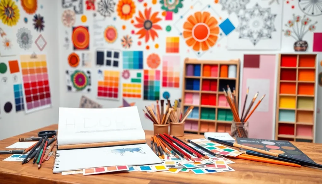
Tools and Resources for Color Palette Creation
Designers can utilize various tools and resources for creating effective color palettes. Online color palette generators offer user-friendly interfaces to experiment with colors. Websites like Coolors and Adobe Color allow users to generate palettes based on a selected base color or through random combinations.
Color wheels play an essential role in understanding color relationships. They facilitate exploration of complementary, analogous, and triadic color schemes. Many digital color wheels provide interactive features to visualize color pairings.
Mood boards serve as another valuable resource. These visual collages help designers collect inspiration from different sources. By compiling images, fabrics, and colors, they can evaluate how elements work together.
Social media platforms, particularly Pinterest and Instagram, act as abundant sources of inspiration. Designers often save and share color palettes that resonate with them. This practice encourages trends and showcases diverse styles.
Books focused on color theory also contribute to informed palette creation. Notable publications explain the psychological effects colors have on emotions and perceptions. Understanding these concepts equips designers to make deliberate choices.
Lastly, mobile applications enhance on-the-go color selection. Apps like Paletton and Color Hunt provide instant access to curated palettes and inspiration. By harnessing these tools and resources, designers align their visions with effective color strategies.
Color palettes are essential in creating impactful designs that resonate emotionally with audiences. By understanding the psychological effects of colors and drawing inspiration from various sources, designers can craft unique palettes that tell compelling stories. Experimentation is key, and utilizing tools like color wheels and online generators can streamline the creative process.
Whether it’s through nature’s beauty or cultural influences, the right color combinations can transform any project. Embracing the art of color selection allows designers to enhance the overall experience and mood, making their work not just visually appealing but also emotionally engaging.